QOMPLX
Streamlining the Quote Pricing Process
Web Platform / UX • UI • Testing
About the Project
Time Frame
Q3 2021
1 month
Client
QOMPLX
Skills
Wireframes
User Flows
Visual Design
Prototyping
Dev Handoff
Tools
Figma
Jira
Google Suite
Role
Lead Product Designer
Team
Randall Thomas, Design Manager
Ted Sandler, Product Manager
Alex House, Front-End Developer
Mark Silvestri, Subject Matter Expert
Bharat Amin, Subject Matter Expert
Description
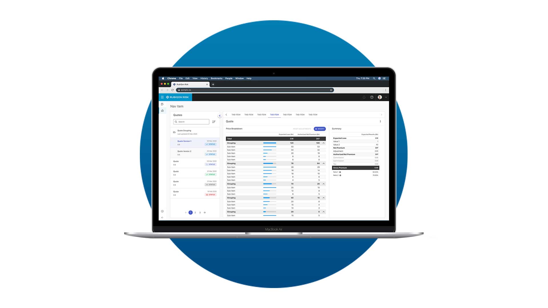
QOMPLX was a risk analytics company that had a flagship proprietary analytics platform which helped organizations better quantify, model, and predict risk concentrated in three areas: cybersecurity, insurance, and finance. RubiQon, QOMPLX's insurance offering, intended to digitize the underwriting process by funneling all the tools an underwriter would need to evaluate and price risk on one single platform.
As the design lead for the Insurance product team at QOMPLX, I was responsible for evaluating existing screens and identifying new opportunities to improve the user experience for the platform MVP. I worked closely with the product manager and subject matter experts to develop user flows and new visual interfaces for the brokers and senior underwriters using the RubiQon platform.
Result
Once I got sign off from all of the stakeholders to make sure it met product and tech requirements, I handed off these designs to Alex, the front-end dev, to build as part of the platform MVP.
☂️
Insurance Underwriting Pricing
Traditionally, underwriters determine premiums by relying on historical data, intuition, and manual processes to assess risks associated with policyholders. With QOMPLX, both brokers and underwriters would be able to leveage its data analytics platform to price premiums faster and more accurately all under one product. What this looked like was brokers would submit their quote submission with revelant data and files for in-house underwriters to review and process. The below is this process mapped out.
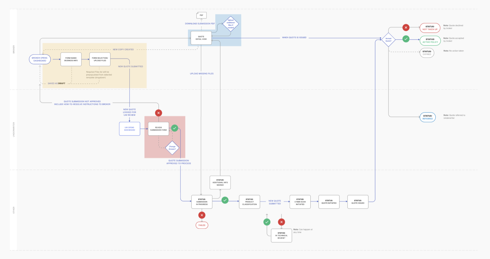
This Insurance Underwriting Pricing design effort was broken into 3 parts:
Dashboard and Detail Page
Allow brokers to easily see all submissions and quotes, so they can quickly identify different statuses and which ones need further action.
Navigation Panel
Allow underwriters to organize their submissions by groups and maximize space to view details, so they can easily review submission details.
Price Summary/Breakdown
Transform the static page into an editable interface, allowing underwriters to adjust quote pricing based on relevant data.
Dashboard and Detail Page
Brokers often submit multiple quotes or submissions for review, so staying organized is key. A dashboard that shows all quotes and submissions is crucial for tracking progress. When a submission needs more information, acting quickly becomes even more important.
Goals
Dashboard
- See top level information for each
- Different statuses for submissions and quotes
- Alert when action is required (i.e. additional files, accepting or rejecting a quote)
Detail page
- Show details of the submission/quote
- Inform of status within the quote process and history of changes
- Inform broker when theres an action they need to take (i.e. additional files required, accepting or rejecting a quote)
Dashboard
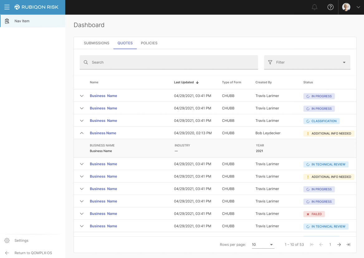
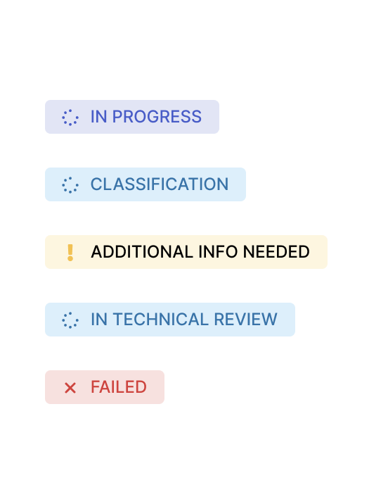
Submission statuses
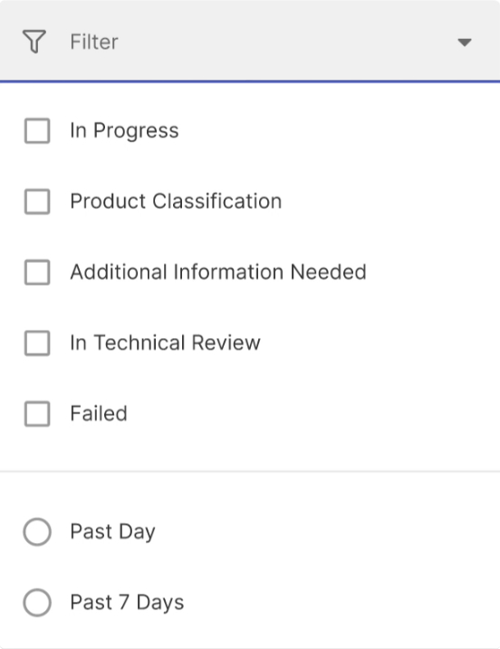
Search + Filter for easier findability
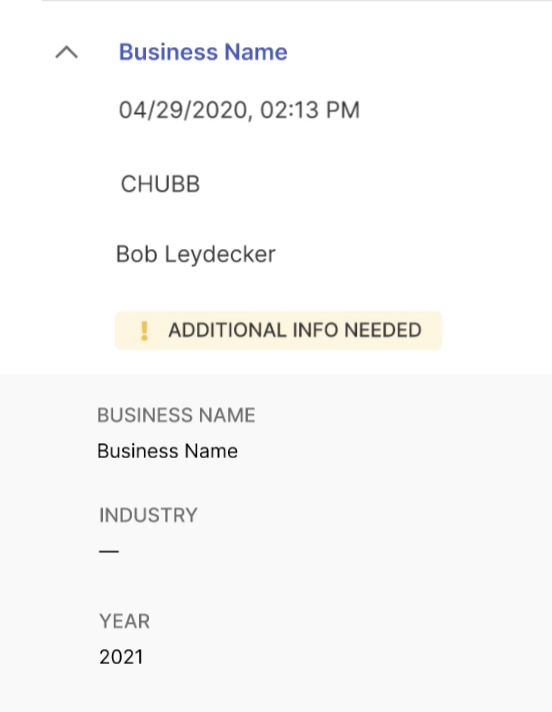
Top level info and info in expanded row
Detail page
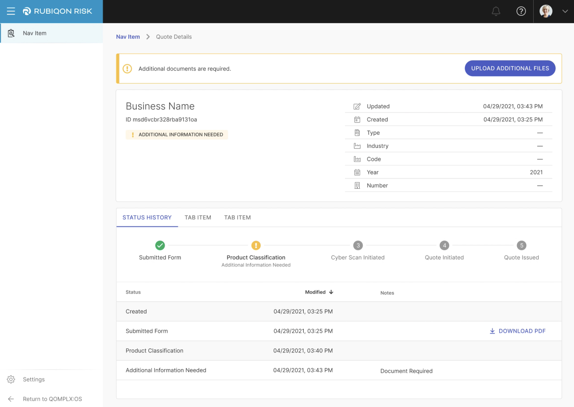
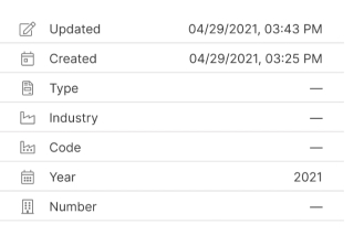
Submission details

Warning banner with corresponding status
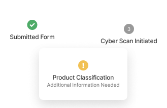
Horizontal stepper showing stage in process
Navigation Panel
A Senior Underwriter using the RubiQon platform reviews multiple submissions from various brokers. Sometimes, there are similar submissions. It's crucial for them to quickly find what they need. With so much information to review, underwriters prefer having as much space possible to review each submission thoroughly.
Goals
- The user should be able to view individual groups as well as quote groupings.
- The user should be able to see the name, limits, date of submission, and status of each submission.
- The collapsed panel should maximize the amount of space for the submission details.
Solution
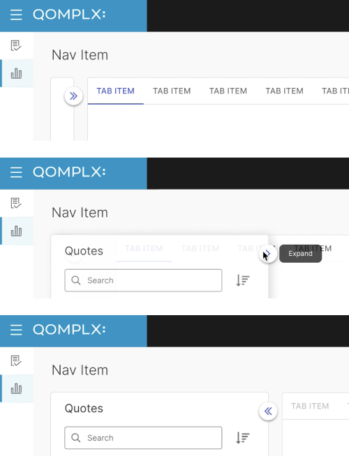
Three navigation panel states to show and hide the nav panel: collapsed, hover and expanded.
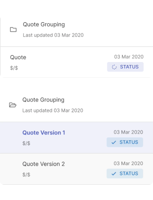
Different styling of groups and individual submissions/quotes.
Price Summary/Breakdown
Redesign the policy summary and pricing breakdown screen so that a senior underwriter is able to make manual adjustments to a policy and clear the adjustments if needed. They should then be able to understand what other values in the policy has been affected from the modification.
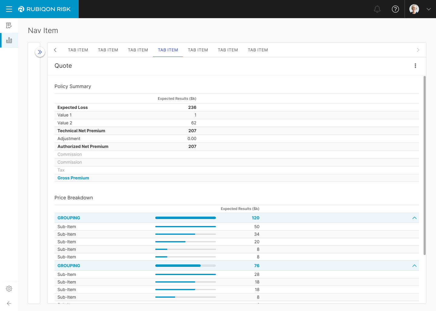
Previous design
The previous design provided a static summary and price breakdown. With the collapsible navigation panel creating more horizontal space, I could experiment with different layouts.
Goals
Editing Logic: Wireframing
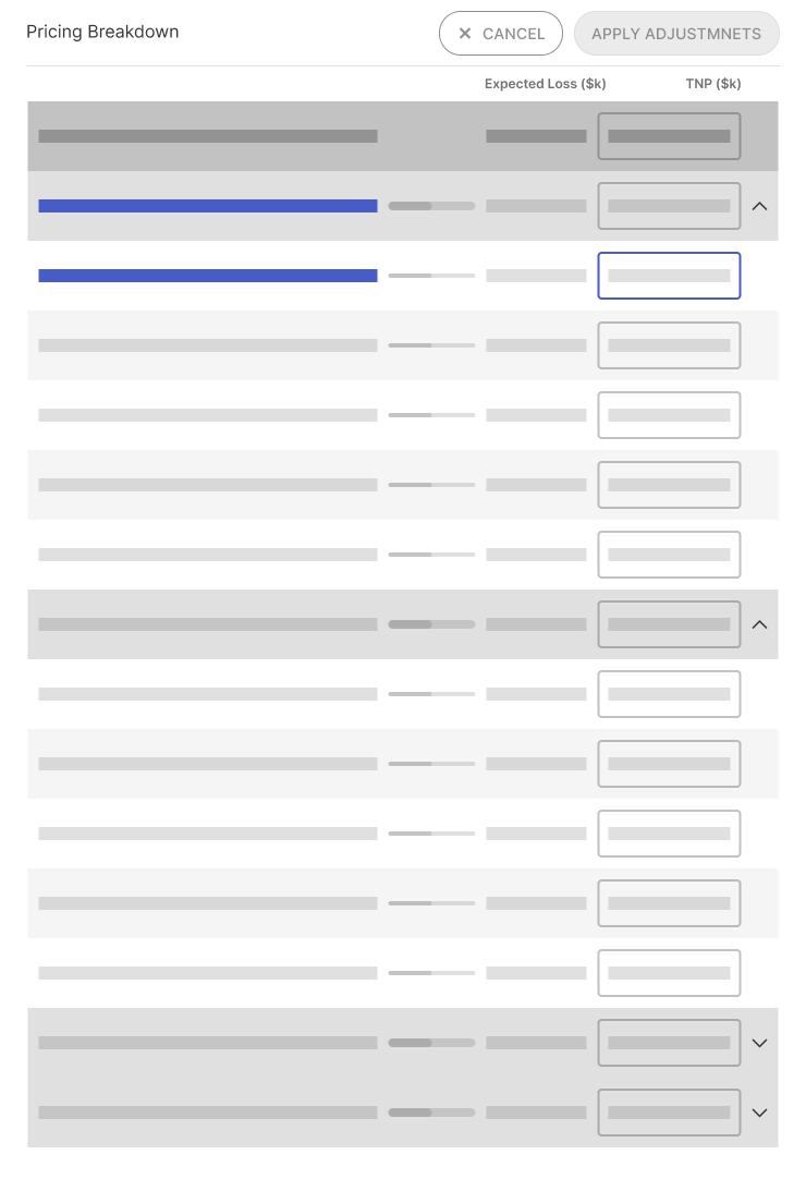
Sub-item level change
Affects group
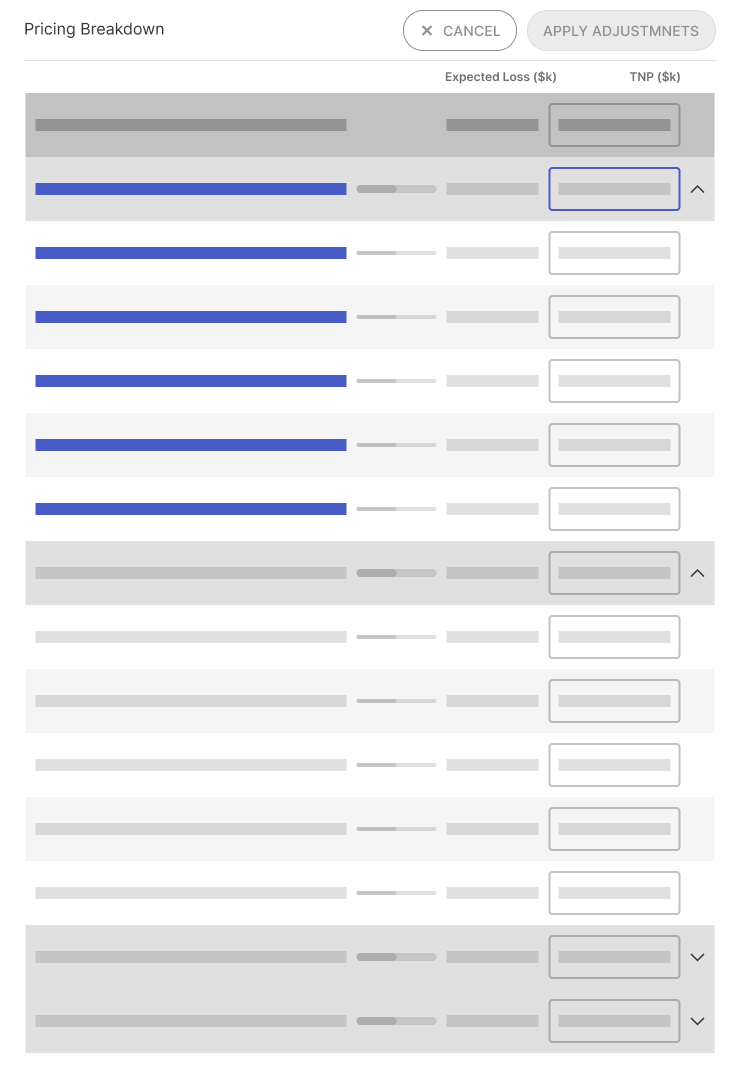
Group level change
Affects sub-items
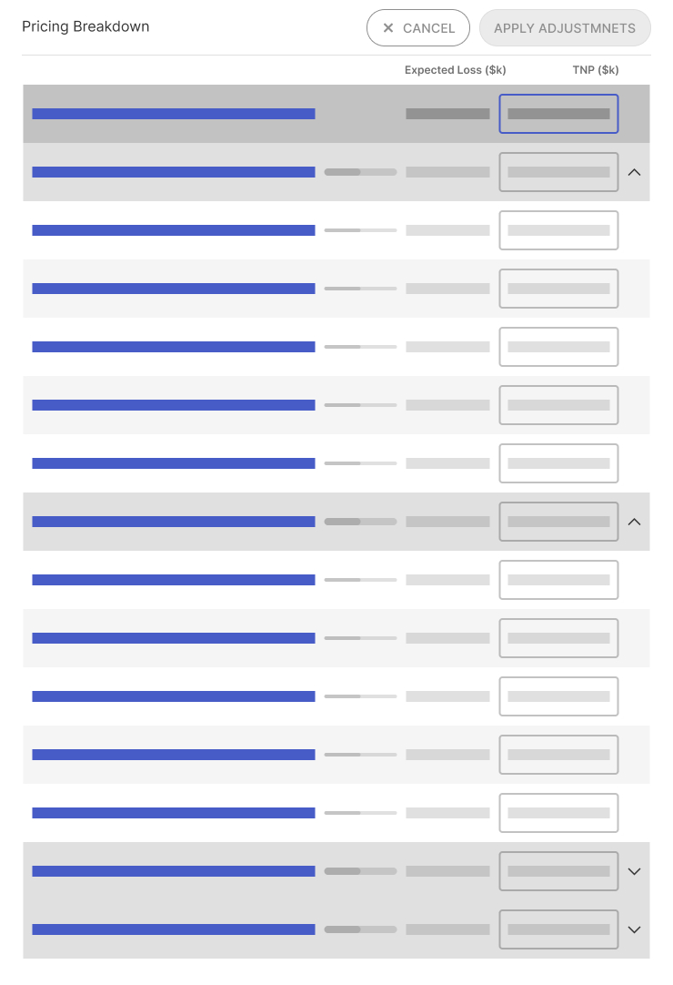
Overall change
Affects all groups and sub-items
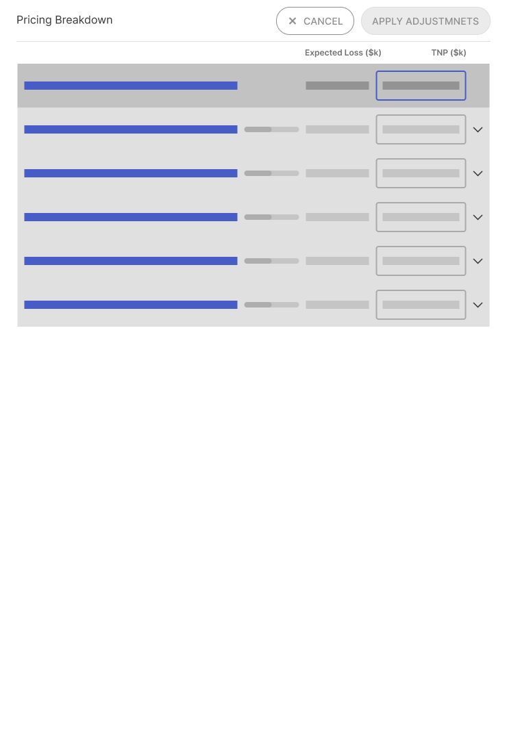
Overall change: collapsed view
Making Adjustments
Focus on the editing space
Summary section opacity is lowered
Calling out changes made
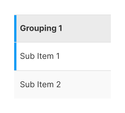
Modified/affected rows are highlighted

Dynamic visual indicators
Slider bars show the proportion of the row value to the total
Additional instructions
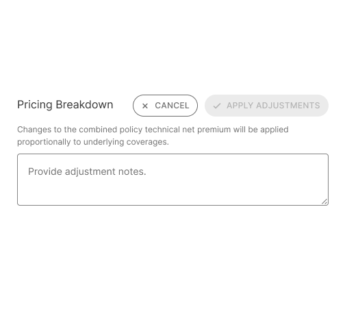
Contextual text is located above the adjustment notes.
Change notes required
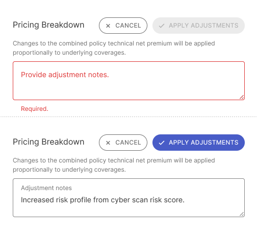
"Apply adjustments" button is disabled until the adjustment notes are entered
Doing a little test and eating pie 🥧
While the team felt good about the designs, I wanted to do a usability test run. There's no bigger humble pie than seeing users actually using the product—and what a big slice of humble pie it was. 😬
I ran two rounds of qualitative testing, asking participants to make adjustments in the editor.
The Good
All participants had no problem entering editing mode, applying, and clearing adjustments.
The Not-so-good
Most participants missed the explanation on proportional changes, leading to confusion about how the values were being applied, which then cascaded to the subsequent tasks.
Most participants didn't understand the hierarchy between groups and sub-items.
Most participants did not notice the effects of the modifications on the pricing summary.
Solution
Editor view
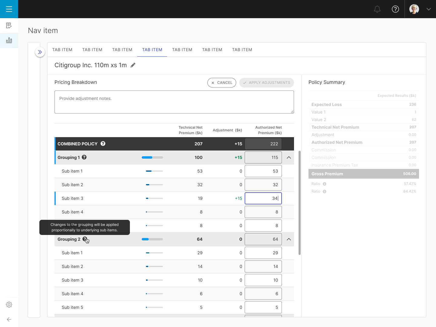
- Instructions are located in tooltips and are placed in context, next to the total and group levels.
- There's more visual distinction in the group and sub-level item sliders
- Adjustments are color coded based on the value, with positive adjustments shown in green and negative adjustments in red.
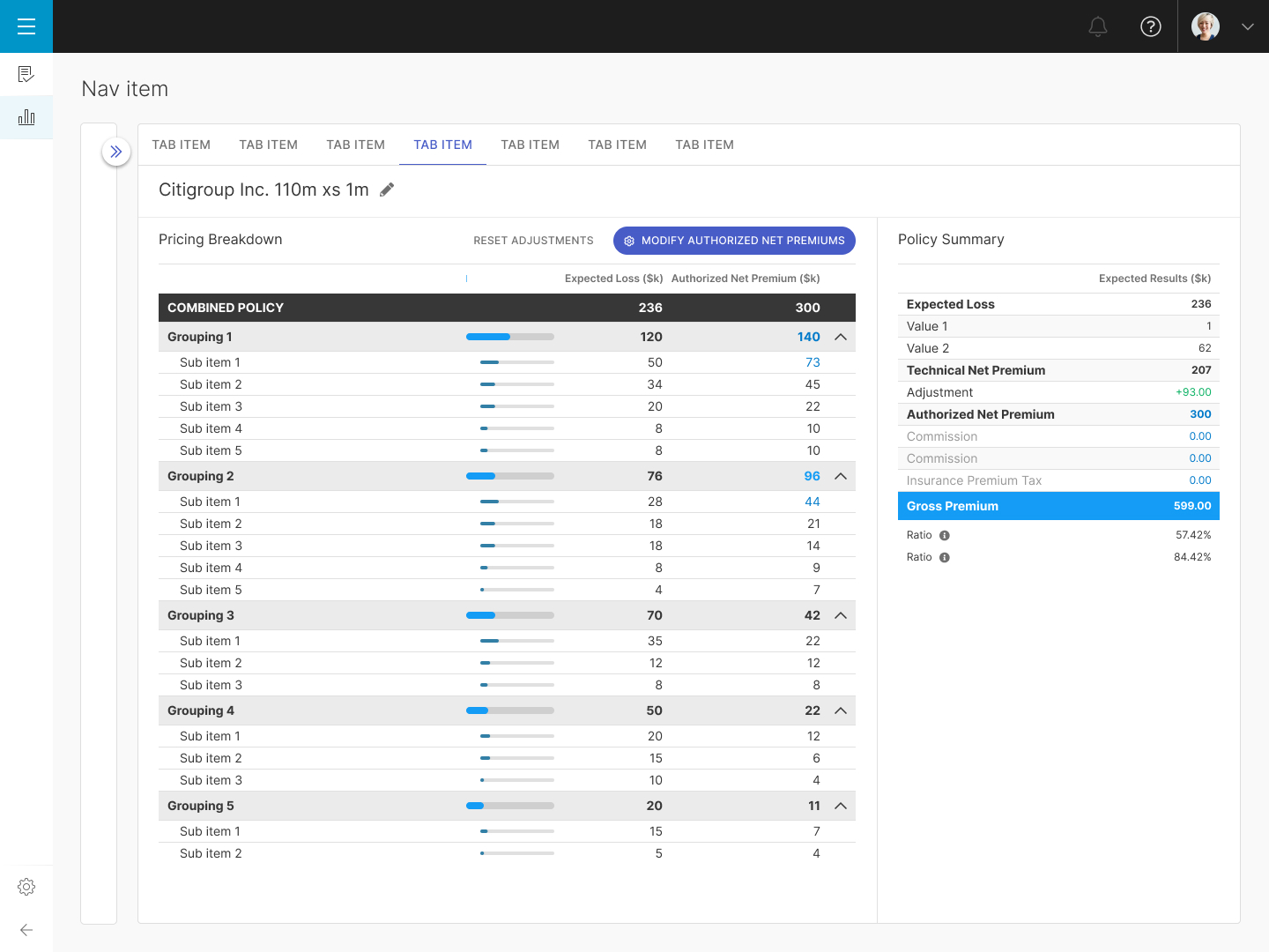
Pricing Breakdown (Adjusted)
Adjusted values are highlighted in blue, with positive adjustments shown in green and negative adjustments in red.
Design System
The QOMPLX platform uses an established design system based on the Vuetify Vue UI Library. In cases in which I couldn't find a proper UI component that matched my use cases, I would contribute to the existing design system with additional variations.
Learnings
How to adapt to additional requirements
Even with SMEs, developing a pioneering product will undoubtedly unearth changes in scope in order to create a better experience for the user. This was an exercise learning to adapt to these changes.
Testing is key
No matter how logically our team plans for how the product worked, it is humbling to have users engage with the product and provide feedback on their experience.
Made with XG -Howling on repeat 🐺
🌱 2024